Scan Me Doesn't Sell: Turning QR Codes Into Brand Invitations
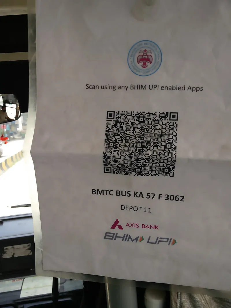
Photo: Mallikarjunasj, CC0, via Wikimedia Commons
There's a receipt on my kitchen counter with a QR code the size of a postage stamp and a caption that just says "Scan here." Scan here for what? A survey? A coupon? Somebody's fifth attempt at a loyalty program? I've had that receipt for nine days and I have not scanned it. Neither has anyone else in my house. That, right there, is the entire problem with how most American brands deploy QR codes: they treat the code as a delivery mechanism instead of a greeting.
A scan is a handoff. Someone standing in a store aisle, or holding your box, or sitting in a folding chair at your pop-up, has decided to give you three seconds of thumb effort. That's a small but genuine act of trust. What you do in the next four seconds determines whether they ever do it again.
Start With the Moment, Not the Menu
The instinct, when a brand buys its first batch of QR stickers, is to send every scan to the homepage. It's safe. It's also the equivalent of handing someone a brochure when they ask a question. The homepage is built for strangers browsing; the person scanning your box is not browsing. They're mid-moment, holding a physical object, often with one hand.
So build the destination around the context:
- On packaging: the person already bought. Don't sell. Help. Setup videos, a two-minute recipe, a care card, a warranty registration that takes forty seconds instead of four minutes.
- On receipts: they're standing near your counter or at their kitchen table. Give them something immediate — a next-visit code, a size exchange portal, a single-question feedback tap.
- On retail displays: they haven't decided yet. Show the comparison, the real product in motion, the size chart, the reviews from people who look like them.
- On event signage: the moment is loud and brief. One action, big type, no login wall. Collect the email now, be interesting later.
One destination per placement. That's the rule. The moment a code splits into "choose your adventure" menus, you've lost people who are already distracted.
Earn the Tap With Something the Room Can't Give
The best offline-to-online moments offer something the physical environment can't. A shelf talker can't play a fifteen-second demo. A receipt can't remember your size. A booth backdrop can't answer a question at 11 p.m.
That's your incentive logic. Not a generic 10% off, which trains people to scan for discounts and never for anything else, but something native to the handoff: a restock alert on an item that always sells out, a fitting guide that finally explains the difference between two sizes, a behind-the-scenes clip of the factory that made the thing they're holding. Nordstrom-style service, delivered from a paper tag.
Print the promise next to the code. "Watch how it's made" outperforms "Scan for more" by a mile, because it answers the question before it's asked. If your caption needs a comma and a clause to explain itself, rewrite it.
Make the Landing Page Match the Paper
Nothing kills a scan faster than a slow, cookie-bannered, pop-up-covered desktop page loading on a phone in a parking lot. Three things, non-negotiable: it loads in under two seconds on LTE, it opens with the thing you promised, and it has one primary button.
That button should do something the person can't do with their hands. Book it, save it, watch it, add it to wallet, text it to themselves. A scan should end in an action, not a scroll.
It's also worth auditing what happens when the scan fails — because some will. Old phones, bad lighting, a smudged label. A friendly plain-text backup URL and a short custom code below the code costs nothing and rescues the folks who'd otherwise just give up.
Measure Relationships, Not Scans
Here's where most dashboards lie to you. A raw scan count tells you the code was visible. It doesn't tell you whether the handoff worked. Track the scan-to-action rate instead: what percentage of scanners actually did the thing you built the page for? Then track the return rate — did any of those people come back within thirty days without a discount nagging them?
A code that gets 4,000 scans and 12 email signups is a sticker. A code that gets 900 scans and 340 saved items is a channel. If your team is reporting scan volume in a monthly deck and nothing else, you're celebrating the door opening while ignoring the fact that nobody walked in.
One more thing worth doing: put a different code on each placement, even if they lead to the same page. It costs almost nothing at print time and it tells you whether the packaging is doing the work or the register display is. We've seen brands discover that their receipt code outperformed their packaging code three to one — a useful fact that would have stayed invisible under a single tracking link.
The Handshake Test
Before your next print run, run one question past someone who didn't design the campaign: would you scan this? If the answer is a shrug, the code is a chore. If it's a quick "oh, yeah, I'd want to see that," you've built an invitation.
The technology is old enough now to be boring, which is exactly why it's useful again. Nobody's impressed by a QR code in 2026. They're only impressed by what happens after they point their camera at it — and that part is still entirely on the brand.