The Comeback Package: Designing a Return That Feels Like a Brand, Not a Bureaucracy
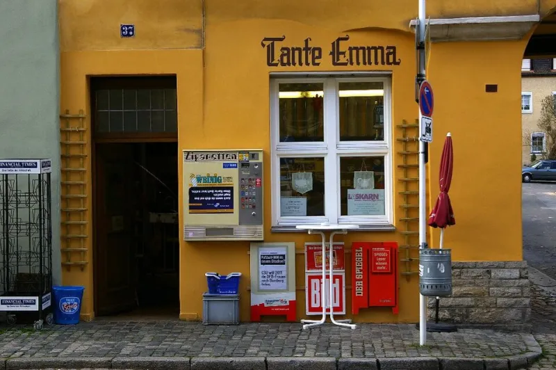
Photo: Reinhard Kirchner, CC BY-SA 3.0, via Wikimedia Commons
Returns get filed under operations: rate, cost, fraud, disposition. That is understandable. Returns are expensive, and most US brands treat the experience like a form to be survived. But by the time a shopper prints a label or pulls up a QR code, they have already made a judgment about your brand. The return is not the fine print of the purchase. It is the second act.
At BrandCraft, we look at returns the way we look at any campaign touchpoint: does this moment carry the brand forward, or does it quietly erase what the first purchase promised? The answer usually lives in small choices—the label, the insert, the microcopy, the drop-off instructions, the follow-up email. None of them are glamorous. All of them are brand assets.
The label is a handoff, not paperwork
Most return labels are designed to survive a scanner. Fair enough. But a label is also a tiny piece of brand real estate that travels through a mailroom, a UPS Store, or a USPS counter. It sits next to a packing slip. It gets photographed by a phone. It is one of the few physical artifacts of your brand that a customer handles after the sale.
That does not mean turning the label into a billboard. It means making the handoff feel coherent. If your outbound package is warm, direct, and a little witty, your return portal should not sound like a compliance memo. If your brand promises ease, the return flow should not require a scavenger hunt for the order number. The label is where the promise gets tested.
The second unboxing begins before the box is taped
The return experience starts inside the outbound package. A return insert should do three jobs: tell the shopper how to start, offer a reason to come back, and set a realistic expectation for what happens next. Most inserts do only the first job, and often badly.
A better insert is short and specific. It names the portal, explains whether the label is prepaid, and points to an exchange option before the shopper defaults to a refund. It can be a single card with a QR code and one line of human copy. The point is not to hide the return. The point is to make the return feel like a door, not a wall.
US shoppers have been trained by large retailers to expect fast labels and no-questions returns. They have not been trained to expect warmth. Warmth is the differentiator. A small brand can win the second act simply by sounding like a person who is glad the customer showed up in the first place.
Microcopy that lowers the temperature
Return flows are full of words that make people feel like a suspect: authorization, eligibility, disposition, resolution. Replace them with plain language. Start a return. Choose what happened. Pick a drop-off. Track your refund. Those are not just clearer; they are calmer.
The best return portals also set expectations at the right moment. Tell the shopper when the refund clock starts—after the carrier scan, not after the label is printed. Tell them how long the review usually takes. Tell them what to do if the QR code will not load. And put the exchange offer at the reason-selection step, not after the refund is already in motion. That is when the shopper is still thinking about the product, not just the paperwork.
Tone matters most when something has gone wrong. A return is a small disappointment, even when it is easy. The copy should not be bubbly. It should be steady. Think of it as the brand equivalent of a calm person at the counter who says, no problem, we can sort this out.
The drop-off is a scene, not a transaction
QR codes have made returns feel like a magic trick, but the physical handoff still carries weight. A shopper walks into a store, hands over a package, and hopes the person behind the counter knows what to do with it. If your return label says drop at any UPS location but your portal says schedule a pickup, you have a trust leak. If your instructions assume a printer when most shoppers are using a phone, you have friction.
Make the drop-off checklist small and local. Name the carriers you support. Explain whether the QR code needs to be shown or printed. Tell the shopper what to keep—the receipt, the tracking number, the confirmation screen. Then send a follow-up when the package is scanned. That scan email is the return flow’s thank-you note. A refund notice is not a relationship. A scan confirmation is proof that you are paying attention.
A 45-minute audit for the second act
You cannot design a better return experience from a dashboard. Order from your own store. Return the item. Time yourself. Then review four passes.
- Materials: Look at the insert, label, and packing slip together. Do they match the outbound voice? Is the return address legible? Is the QR code large enough to scan without squinting?
- Portal: Start on your phone. Does the first screen ask for an order number before offering help? Is the exchange option visible before the refund path? Does the reason list sound human?
- Drop-off: Are the instructions specific to US carriers and local drop-off options? Does the confirmation screen say what happens next and when?
- Follow-up: Does the shopper get a scan email? Is the refund timeline clear? Is there a one-click path back to the store?
Score each pass from one to five. Anything under three is a leak. Fix the leaks in the order the shopper experiences them, not the order your internal team prefers.
The exchange is the plot twist
Exchange incentives work when they feel like a door, not a trap. Free exchanges, a small credit toward a swap, or a returnless refund for low-cost items can all make sense. But the offer has to be clear and genuinely comparable. Do not bury the refund option. Do not make the shopper call to cancel a return. US customers punish dark patterns with silence, and silence is expensive.
The goal is not to keep every sale. It is to keep the relationship. A shopper who returns a jacket but swaps it for a better size is still a customer. A shopper who returns a jacket and gets a calm, clear, human experience may come back next season. That is the second act doing its job.
Design the goodbye like you designed the hello
Your unboxing gets a mood board. Your return should get a checklist. The brands that win the second act are not the ones with the cheapest label. They are the ones who make the label feel like part of the story—coherent, calm, and built for the moment after the sale. By the time the 2026 holiday orders settle and the January return wave arrives, the return label will be the last physical thing many shoppers touch. Make it count.