The Couch-Search Window: Designing CTV Spots That Survive the Phone Grab
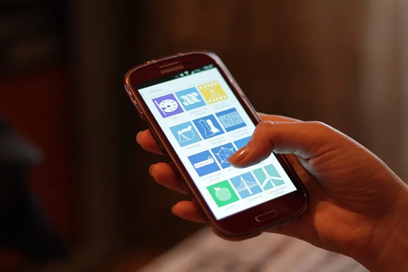
Photo: Océanos y dados, CC0, via Wikimedia Commons
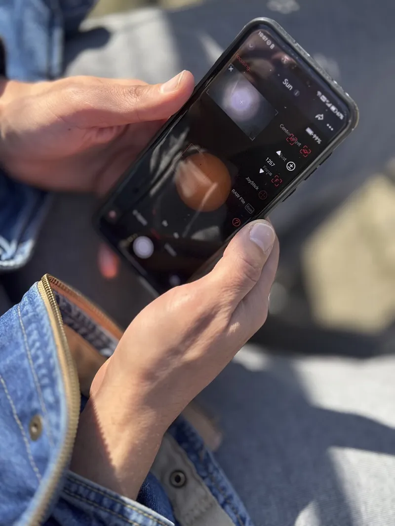
There is a very specific American living-room moment that most media plans still ignore. The spot is running. The viewer is half-watching, half-scrolling. Then something on screen catches an eye, and the phone comes up. Not to shop yet — just to check. To search the brand name, squint at the product, or ask the group chat whether anyone has tried it.
That is not a distraction from the campaign. It is the campaign's second act. And if the brand has not built a bridge from the TV screen to the phone screen, the handoff dead-ends in a search results page full of competitors.
The 15-Minute Window Is the Real Second Act
Most TV and CTV reporting treats the impression as the finish line. The spot aired. The GRP landed. The dashboard updates next morning. But the behavior that matters often happens in the first 15 minutes after the spot: branded search, direct traffic, a promo code typed into a phone, a product page opened in a new tab.
Build that 15-minute window into the measurement plan before the buy goes live. For linear TV, use the air time. For streaming, use platform impression timestamps where available. Compare branded search and direct traffic in that window against a clean baseline — same day last week, same hour, no spot. You are not trying to prove causation with laboratory precision. You are looking for a pulse. A small, repeatable lift in branded search is a better signal than a vague awareness number that arrives three weeks later.
The window also changes how you brief the spot. If the goal is a handoff, the last five seconds are not a logo card. They are a search prompt.
Give the Viewer Something They Can Type
A hashtag is not a search cue. A clever URL with three slashes is not a search cue. A search cue is a phrase a human can hear once, remember for 30 seconds, and type with a thumb.
The simplest version: brand name plus one plain word. Not a slogan. Not a pun. A word that appears in the spot, on the product, and on the landing page. For a skincare launch, it might be the brand name plus glow. For a home goods brand, the brand name plus the product category. The cue should be spoken aloud and shown on screen at the same time. If the brand name is hard to spell, say the spelling or buy the common misspellings. Do not make the viewer guess.
One more rule: do not bury the cue in a joke. Humor is fine earlier in the spot. The cue is a signpost, and signposts should be boring enough to work.
The On-Screen Slug Should Look Like a Search Box, Not a Title Card
On-screen slugs — the text overlays that carry a URL, a code, or a search prompt — often get designed like film titles. Elegant serif. Slow fade. Tiny legal line. That is a mistake on a TV or CTV screen, where the viewer is 10 feet away and half-distracted.
Treat the slug like a search box. Plain sans-serif. High contrast. Four seconds minimum. No punctuation the viewer has to parse. If you are using a QR code, give it room and a plain-language instruction. QR codes work for some audiences, but they are not a universal remote. The text cue should still be there for the viewer who would rather type.
Show the cue early and again at the end. The first mention plants the thought. The second catches the phone grab. Keep the same words both times. Consistency is the whole trick.
Defensive Search Buys Are Not a Luxury
If the spot works, people will search. Some will spell the brand wrong. Some will search the product category plus the cue. Some will search the brand name plus where to buy. A defensive search buy catches those handoffs instead of letting a competitor's ad do it.
Keep the search plan narrow: brand terms, common misspellings, brand plus product, brand plus the cue word. Match the landing page to the spot's language. If the spot says glow, the landing page headline should say glow. Do not send a TV-driven search to a generic homepage with a rotating carousel. Send it to one page with one job.
This is not about bidding on every category term in sight. It is about owning the small patch of search real estate that your own spot just created. The budget can be modest. The discipline is what matters.
The Handoff Page Has One Job
The landing page is where most second-screen handoffs leak. The viewer searches, clicks, and lands on a page that feels like a different campaign. Different photo. Different offer. Different tone. The phone gets locked, and the moment is gone.
Make the handoff page echo the spot. Same product. Same cue word. Same visual world. One primary call to action. If there is a promo code, show it plainly. If there is a limited offer, say when it ends. Do not make the viewer hunt for the thing they just saw on TV. The page should feel like the next frame of the same story, not a detour into a brand archive.
Measure the Handoff, Not Just the Impression
A 15-minute post-spot window gives you a leading indicator, not a final verdict. Track branded search volume, direct traffic, code redemptions, and assisted conversions. Keep a simple dashboard that compares the window to baseline. Review it after the first week, not after the whole buy.
If the pulse is weak, do not automatically blame the creative. Check the cue. Check the slug. Check whether the search buy was live. Check whether the landing page loaded fast on mobile. The handoff has more moving parts than a 30-second spot, and the weakest link is usually the one nobody briefed.
A Pre-Flight Checklist for the Next Buy
Before the next CTV or TV flight, run a five-minute check. Can someone spell the brand after hearing it once? Does the spot say the cue out loud and show it on screen? Is the on-screen text readable from the couch? Are the misspellings bought? Does the landing page repeat the cue? Is there a 15-minute dashboard ready before launch?
If any answer is no, the spot is still a spot. It just is not a handoff. The remote is not the enemy. It is the next click. Design for it, and the living room stops being a dead end.