Leave the Door Open, Not the Trapdoor: A Subscription Exit Audit for US Brands

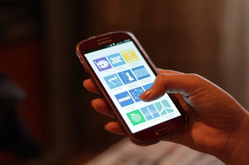
Photo: person canceling subscription on laptop cancellation screen coffee cup, via www.kevinashleyphotography.com
Most subscription brands in the US still treat cancellation as a back-office chore. The acquisition funnel gets mood boards, paid social tests, and a landing page with custom photography. The cancel flow gets whatever the billing platform ships with and a vague instruction to reduce churn. That math is backwards. The cancel screen is one of the few moments when a customer is paying full attention after the sale. It is also the moment when your brand either acts like a host or acts like a bouncer.
At BrandCraft Digital, we have watched enough subscription audits to know that retention is not the same as confinement. A customer who feels trapped will eventually leave, and they will tell people why. A customer who feels respected on the way out may pause, downgrade, come back, or send a friend. The goal is not to eliminate exits. The goal is to make the exit graceful enough that former subscribers still recommend you.
Why the cancel screen matters more than the upsell
American shoppers have become fluent in subscription language. They know when a free trial is about to convert. They know the difference between a pause and a cancellation. They also know when a brand is stalling. That is why the cancel flow deserves the same craft as the checkout page. It is not a legal formality. It is a brand handshake at the exact moment trust is up for renewal.
The practical test is simple: if a customer screenshots your cancel flow and posts it in a group chat, would the screenshot make your brand look thoughtful or sketchy? That is the bar. Not because every cancel flow will go viral, but because the same choices that would embarrass you in public are usually the ones quietly damaging referrals in private.
Start with tone, not the offer
Many teams jump straight to the save offer: a discount, a free month, a downgrade path. Offers matter, but tone gets there first. A cancel screen that opens with guilt, fake urgency, or a wall of red text has already lost the argument. A better opening is plain and human: tell the customer what will happen, how long access lasts, and what they will lose. Then offer the alternatives without making the customer feel hunted.
For US audiences, directness reads as respect. A sentence like, 'You can cancel now and keep access through the end of your billing period,' does more for trust than three paragraphs of marketing copy. If the customer wants to leave, let them. If they want to pause, make that path visible. The tone should say: we are sorry to see you go, and we are not going to make this weird.
The four exits every subscription should name
A good cancel flow does not pretend there is only one door. It names the real options in plain language: cancel, pause, downgrade, and contact support. Each option should have a clear outcome and a clear next step.
Cancel means the subscription stops. Say when. Pause means billing stops for a set period. Say how long and what happens when it resumes. Downgrade means the customer keeps a smaller version of the product. Show the trade-off without shame. Contact support is not a dodge. It is a legitimate exit for billing errors, accessibility needs, or complicated accounts. If your only path to help is a maze, customers will assume the maze is the point.
Dark patterns are a tax on referrals
Dark patterns are not just an ethical problem. They are a referral tax. Confirmshaming, hidden cancel links, fake countdown timers, and surprise phone calls all work in the short term, which is exactly why they spread. But they turn a simple goodbye into a story the customer tells with your name attached. In the US, auto-renewal rules and state-level consumer protection expectations are also getting harder to ignore. The smarter play is to design the exit as if a regulator, a journalist, and a former customer were all watching. Because sometimes they are.
The audit question is not, 'Did we make cancellation hard enough?' It is, 'Did we make cancellation clear enough that the customer trusts us with the next purchase?' A clean exit is cheaper than a chargeback, a complaint thread, or a one-star review that starts with, 'I tried to cancel for twenty minutes.'
Capture the reason without interrogating the customer
Exit surveys are useful, but they should feel like a quick favor, not a deposition. Offer a short list of reasons, allow an optional comment, and make skipping easy. The best surveys are specific enough to route insight to the right team: price, fit, features, support, life change, or switching to a competitor. Do not require an answer to complete the cancellation. Do not hide the finish line behind five screens of questions.
A small thank-you helps. It can be a simple line: 'This helps us fix the right things.' That framing turns the survey into a contribution rather than a toll. It also gives your team cleaner data than a forced dropdown ever will.
Make the referral ask feel earned
Asking a departing customer for a referral can work, but only after the exit is complete and the tone has stayed generous. The ask should be low-pressure and relevant: 'Know someone who might want your spot?' or 'If we ever fix this, we would love another shot.' Do not dangle a reward in front of a customer who is already annoyed. Do not make the referral link the only way to finish. The ask is a door left open, not a hook.
A one-hour audit for your cancel flow
Open your cancel flow on a phone and screen-record it. Then run four checks. First, clarity: can a new customer explain what happens after cancellation in one sentence? Second, tone: does the copy sound like a person or a policy? Third, offers: are pause, downgrade, and support visible without trickery? Fourth, referral: is there a respectful next step after the exit, or only a dead end?
If the flow fails any check, fix the plain-language version first. Then test a pause offer. Then add a short exit survey. Then add a referral ask. Keep the order. The handshake comes before the upsell, and the exit comes before the ask.
In 2026, subscription brands do not need more traps. They need better goodbyes. The cancel flow is not the end of the relationship. It is the last impression before the next recommendation, and it deserves the same craft as the first impression.