Proof of Hands: Why American Shoppers Are Rewarding Brands That Show Their Work
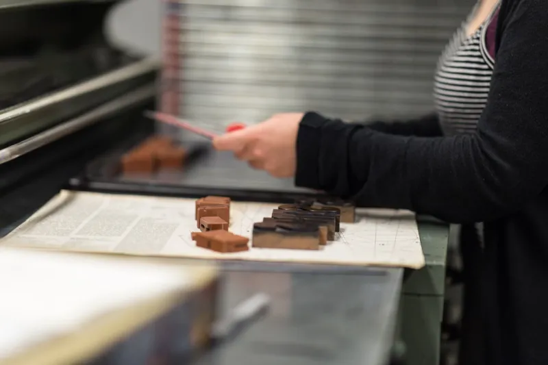
Scroll through TikTok for ten minutes and count the brand accounts that feel interchangeable. Same geometric sans-serif, same peachy gradient, same stock photo of a laughing person holding a mug, same caption cadence. Template culture and AI-assisted production have made visual polish almost free — and that is both the good news and the problem.
Cheap polish raised the floor for everybody. It also flattened the ceiling. When a regional bank, a DTC skincare label, and a taco spot in Austin can all generate a competent-looking campaign in an afternoon, competence stops being a differentiator. What's left is evidence that a human being actually made a decision somewhere in the process.
That evidence is craft. And in 2026, American shoppers are quietly paying a premium for it.
The sameness tax
Nobody walks around saying “I prefer brands with custom type.” But people notice, in a vague, gut-level way, when something looks like it cost thought. Call it a sameness tax: the low-grade suspicion that attaches to brands whose feeds look like everyone else's. If the ad looks generated, the customer starts wondering what else is generated — the reviews, the ingredients, the support team, the founder story.
Craft interrupts that suspicion. Not because a hand-lettered wordmark is inherently more honest than a clean one, but because visible human decisions are a costly signal. Someone chose that awkward-but-right crop. Someone set that kerning by eye. Someone decided the motion should feel like a heavy door closing instead of a bouncy default. Effort is legible. Sloppy effort isn't.
Where craft actually shows up
Craft is not a mood board. It's a set of concrete, repeatable choices. In our work with US brands across retail, hospitality, and B2B, four levers tend to do the heaviest lifting:
Custom or commissioned type. Not necessarily a full bespoke typeface — a single custom display cut used for headlines can carry a brand for years at a fraction of the cost of a family. The point is that it can't be found in a dropdown.
Motion with weight. Template motion is bouncy and frictionless. Craft motion has mass: eased entries, deliberate holds, transitions that respect where the eye already is. It reads as intentional even to viewers who couldn't name what they're seeing.
Editorial photography instead of stock. A half-day shoot with two models, one location, and a photographer who knows how to light a product beats six months of a stock subscription. Imperfect light and real texture photograph as trustworthy in a way that perfectly even studio white does not.
Art direction with a point of view. The cheapest lever and the most ignored. A one-page direction doc — palette, crop rules, what we never do, three reference images — turns a scattered team into a coherent one, and keeps freelancers from drifting.
Paying for it without stalling the calendar
The honest answer to “how do we afford craft” is that most brands don't need more budget, they need fewer, better assets. A typical allocation mistake is spreading a modest production budget across twenty deliverables. Flip it: one hero shoot, one custom type cut, one motion kit, then build the other eighteen deliverables out of those parts.
A practical split we like: treat craft as a fixed line item in the annual brand budget rather than a per-campaign negotiation. Somewhere in the range of 8 to 15 percent of total marketing spend is a reasonable starting frame for brands that have been running on stock and templates. Below that, nothing gets made that couldn't have been generated. Way above it, you're buying art for art's sake — which is fine, if that's the strategy.
The other trick is sequencing. Craft slows the first project and speeds up every project after it. Build a kit — type system, crop rules, motion presets, color tokens, three approved treatments — and the tenth campaign is faster than the first. Brands that feel handmade at scale aren't improvising. They're running a tight system that produces looseness on purpose.
The line between polished imperfection and production chaos
This is where craft projects go sideways. “Made by hand” is not a license for typos, broken contrast ratios, or a website that takes nine seconds to load. Real craft has constraints, and the constraint is usually intent.
Our test is simple: can you name the reason? That grain overlay is there because it softens a hard digital edge on a hero image — fine. That off-kilter headline placement is there because it pulls the eye toward the CTA — fine. That cropped logo is there because someone ran out of time — not fine.
A few guardrails keep the line clean:
- Accessibility comes before texture. Contrast, alt text, and caption legibility are non-negotiable, even in an “analog” layout.
- One expressive moment per screen. Craft reads as confidence when it's concentrated and as noise when it's everywhere.
- Document the exceptions. If the rules get broken on purpose, write down where and why, or the next freelancer will invent new ones.
- Ship on schedule. A campaign that arrives six weeks late isn't more crafted, just slower.
What this means for the next twelve months
The brands pulling ahead right now aren't rejecting technology. They're using it for the parts of the job where output quality is already commoditized, and spending human attention where judgment still shows: type, motion, photography, direction. Four levers, one budget line, one page of rules.
Polish is free now. Proof of hands is not. That gap is where the premium lives.
